If this is your first visit, be sure to
check out the FAQ by clicking the
link above. You may have to register
before you can post: click the register link above to proceed. To start viewing messages,
select the forum that you want to visit from the selection below.
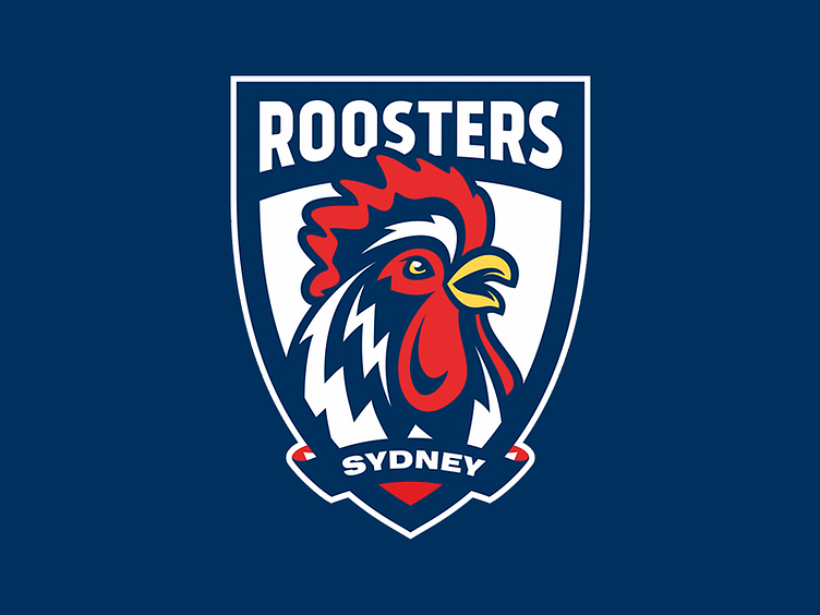
I don’t really like it at first glance but it will probably grow on me.
There seems to be a push in this style of logo from the NRL.
The Broncos and Eagles changed their logo in the last few seasons and I think I saw the Dogs are changing this season so wouldn’t be surprised if we do too with every other team to follow in the next couple of years.
Just my opinion of course and I'm picturing your logo on the jersey. I like the blue coq, the shield and EST. 1908.
I think the word ROOSTERS is too in your face. If you have to have wording, you could minimise the font and have the word Roosters next to or below Sydney at the top as you have.
Alternatively, I think the shield would work well without any wording at all. Again, just my thoughts.
"Do you expect me to talk"? "No, Mr. Bond, I expect you to die".
I'm working on scrapbooking a lot of my memorabilia and on the cover of my first one, I have the botton right hand logo. It was a cardboard one and looks great on the white scrapbook ($9 from K-mart). My other favourites are the top row far right and far left. I'm not familiar with the red one in the middle top row.
Would you be so kind to post some pictures of your Roosters paraphernalia I’m particularly keen too see the numerous Roosters coffee cups
I respect all our moderators here. Past present and even future. Always have done and always will do a wonderful job.
The noble emblem of the Roosters with Easts to Win should never been ditched. It’s our heritage. If I made a change the positioning so it faces East.
The one decision by the Club I have never agreed with irrespective of the Super League war.
The noble emblem of the Roosters with Easts to Win should never been ditched. It’s our heritage. If I made a change the positioning so it faces East.
The one decision by the Club I have never agreed with irrespective of the Super League war.
Me too.
Or a styled full Rooster.
The Tottenham Spurs emblem is an absolute winner, no overplayed fussiness, simply elegant.
Anyway the evolution of Rugby League from the greatest game of all to a marketing opportunity is now complete.
 Tweet
Tweet

")

Comment